
I used to think an agent dashboard needed to show me everything. Every worker. Every service. Every log. Every flicker of activity.
That made sense when I was still doing most of the work myself.
It makes less sense now.
My models have tasks for specific services. They report through their own email accounts. They have their own Discord bot. They run scheduled jobs, pass work between one another, and send updates back to me.
My job has changed from watching the system to checking whether the system is still doing what I expect.
That is what Mission Control is for.
The Dashboard Changed Because My Needs Changed
The earlier versions of Mission Control were more visual. I built dashboards with characters, animated environments, server rooms, and a lot of activity designed to make the system feel alive.
That was fun. I still like that kind of interface.
But I do not need to sit inside the machine all day anymore. The models are doing the service work. I need a place to check the health of the orchestration, see what needs attention, and move on.
The useful question is no longer:
What is every agent doing right now?
It is closer to:
Is anything stale, lapsed, disconnected, too expensive, or waiting for me?
Mission Control is becoming an answer to that question.
A Quick Tour of the Three Tabs
The attached video is a short overview of the three main tabs. It is not a polished product demo. It is a look at the dashboard I am actually using while there is still work left to do.
Above: A quick tour of the three Mission Control tabs, including the places where stale and lapsed cron jobs become visible.
Flow: The Operational Overview
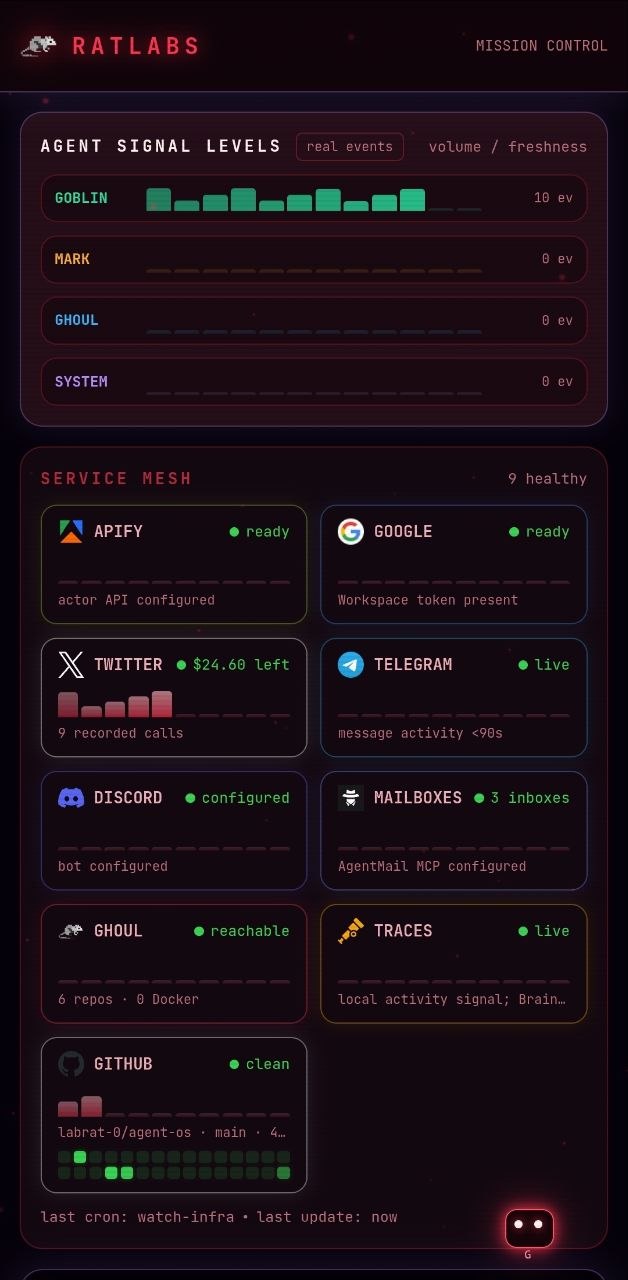
The Flow tab is the landing view. It puts the system in one place:
- Agent signal levels
- Connected services
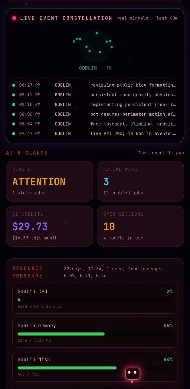
- Live event activity
- A compact event constellation
- At-a-glance health and workload
- Local resource pressure
- Cron state
The important part is that the sections map to things I actually run. The service mesh is not a generic collection of cloud logos. It is a quick view of the tools and channels the agents depend on.
The agent signal levels show which agents have real recent activity. The service mesh shows whether the surrounding services are configured, reachable, live, or stale. Those are different questions, so they should not be collapsed into one green light.
Log: What Happened
The Log tab is where I can look back without opening every agent session individually.
This is useful because the system is no longer one process doing one thing. It is a collection of models and services reporting through different channels. A log view gives me a timeline when I need to answer questions such as:
- Did the research task finish?
- Did the service report an error?
- Did an agent hand work to another agent?
- Did a scheduled job produce a result?
- What changed since I last looked?
Most of the time I do not need to read the whole log. I need enough context to decide whether I can keep moving.
Stats: Models, Tokens, and Cost
The Stats tab is about the part of the system that is easiest to lose track of when everything is automated: model usage.
I want to see which models are being used, how many sessions they are handling, how much input and output they generate, and what that usage costs.
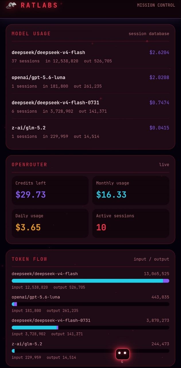
The token flow view makes the distinction between input and output visible. That matters because the cost profile of a model is not just about how many times it runs. It is also about how much context it receives and how much it produces.
This is where the dashboard starts to become more than an operations screen. It becomes a feedback loop for architecture decisions.
If a task is using too much context, I can see it. If a model is producing much more output than expected, I can see it. If the system is quietly using a model that should have been reserved for a smaller task, I have a place to investigate.
Cron Jobs Are One of the Best Reasons to Have the Dashboard
The feature I find most useful is also one of the least flashy.
I can find stale cron jobs quickly.
I can see when jobs lapsed. I can see when something is active. I can see when a job has not run recently enough and needs a second look. That gives me a way to double check the orchestration without manually opening every schedule and trying to reconstruct what happened.
This matters more as the system grows. A scheduled job can fail quietly. A dependency can change. A reporting step can stop receiving the output from the step before it. The failure may not look dramatic. It may just become old.
A stale marker turns that quiet failure into something I can see.
That is the kind of oversight I want from a dashboard. Not more blinking lights. Better questions answered sooner.
The Architecture Is More Live Now
The architecture overview is becoming a live view of how the system is connected:
me
  |
  v
Mission Control
  |
  +--> agent tasks
  +--> service mesh
  +--> email reporting
  +--> Discord reporting
  +--> model usage
  +--> token flow
  +--> cron state
  +--> local activity signals
The models are not just interchangeable workers. They have responsibilities. A model may be assigned to a research service, a marketing service, a reporting loop, or an operational check. The dashboard gives me a way to see the connections without pretending they are all the same kind of activity.
There is still a distinction between local activity signals and a full tracing system. The dashboard can show the activity it receives, but that does not mean every event is a complete distributed trace. That distinction is important when deciding what the system actually proves.
Email and Discord Changed the Relationship
The agents now have their own reporting channels.
Email gives each service a durable reporting path. Discord gives the system a conversational place to report activity and status. Mission Control gives me the visual overview when I want to pull the system up and inspect it.
That combination is better than forcing every update into one stream.
- Email: durable reports and messages that need to be found later
- Discord: conversational updates and service-level communication
- Mission Control: operational overview and visual double check
The agents can do more of the service work without requiring me to sit in the same interface all day. I can let the channels collect the details and use the dashboard to check the shape of the system.
That is a much better division of attention.
The Moon-Gravity Goblin
There is also a small bot crawling around the interface.
It is not there because the dashboard needs a bot. It is there because software should be allowed to be a little fun.
The Goblin can be picked up and moved around the screen. When I let go, it keeps the motion from the drag, floats with low gravity, drifts across the screen, and bounces from the edges and bottom.
It is a tiny detail, but it changes the feeling of the dashboard. The rest of the interface is about state, freshness, cost, and orchestration. The Goblin is a reminder that I am still building this for myself.
There is room for a little personality in the control room.
This Is Still a Work in Progress
I like this version much more, but it is not finished.
There is still work to do around deeper tracing, richer model comparisons, and making the architecture view more useful as the number of services grows. The visual language is still changing. Some parts are intentionally compact. Other parts are still looking for the right balance between density and readability.
That is fine.
The important change is that the dashboard now matches the way I work. I am less in the loop on every individual task because the models have taken on specific service responsibilities. The dashboard does not try to pull me back into every task. It gives me a way to verify that the overall system is healthy and find the exceptions.
I have gone from managing activity to managing attention.
I Am Not the Only One Building This
A lot of people in the community are creating their own dashboards for agent systems.
I am excited to see what comes from that. Everyone's infrastructure is a little different. Everyone has a different tolerance for noise, a different set of services, and a different definition of what needs human attention.
Maybe there will eventually be a dashboard pattern that works for all of us.
Or maybe the better outcome is a collection of dashboards that share useful ideas while still reflecting the systems behind them.
I am interested in both possibilities.
For now, I have something that lets me open one screen, see the agents, check the services, find stale cron jobs, review model usage, and decide whether anything needs me.
That is a much better oversight loop than the one I had before.
Resources
Tools and Platforms:
- Hermes Agent - The agent orchestration framework behind the system.
- OpenRouter - Model routing and usage visibility.
- Discord - Conversational reporting channel for agent services.
- FastAPI - Backend framework used for the dashboard service.
- Tailscale - Private network access for the dashboard.
Related Posts: